
Server Dashboard
The mcpr.app dashboard gives you real-time visibility into your MCP server’s health, performance, and traffic patterns — from a single page.
When you open a server in mcpr.app, the Dashboard tab is the default view. It shows summary metrics, client breakdown, and seven sub-tabs for drilling into specific aspects of your server.
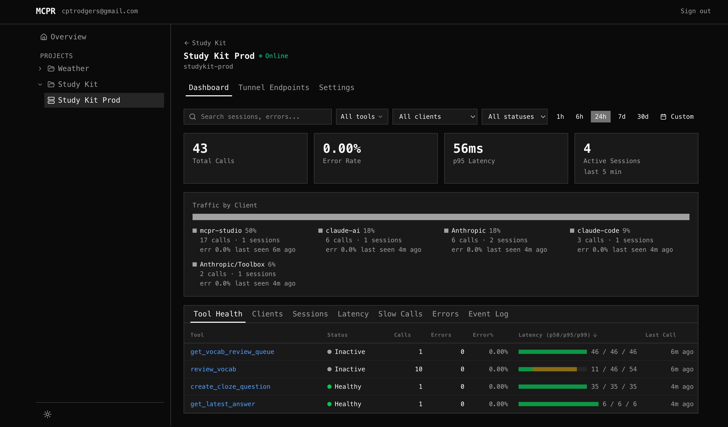
Summary Cards
Section titled “Summary Cards”Four cards at the top show at-a-glance metrics for the selected time range:
| Card | What it shows | Why it matters |
|---|---|---|
| Total Calls | MCP request count, with % change vs previous period | Spot traffic spikes or drops |
| Error Rate | % of failed requests, with trend arrow | Is your server getting less reliable? |
| p95 Latency | 95th percentile response time, with delta in ms | Catch performance regressions |
| Active Sessions | Unique sessions with activity in the last 5 minutes | Who’s connected right now? |
All cards respect the selected time range (1h / 6h / 24h / 7d / 30d / custom).
Client Breakdown
Section titled “Client Breakdown”Below the summary cards, a colored proportion bar shows where traffic comes from. mcpr identifies clients from the clientInfo field in the MCP initialize handshake — ChatGPT, Claude, VS Code, Cursor, etc.
Each client shows: call count, session count, error rate, and last seen time. Click a client to filter the entire dashboard to that client’s traffic.
Tool Health
Section titled “Tool Health”The default sub-tab. One row per tool. “Is each tool working?”
| Column | What it shows |
|---|---|
| Tool | Tool name (clickable — jumps to Event Log filtered to that tool) |
| Status | Healthy (green), Degraded (yellow), Down (red pulsing), Inactive (gray) |
| Calls | Total calls in time range |
| Errors / Error% | Error count and rate, color-coded by severity |
| Latency (p50/p95/p99) | Visual bar + numbers showing latency distribution |
| Last Call | Time since the most recent request |
All columns are sortable — click any header. Default sort: p95 descending (slowest tools first).
How status works
Section titled “How status works”Status is based on actual evidence, not just arbitrary thresholds:
| Status | What it means |
|---|---|
| Healthy | Error rate < 5%, p95 < 2s, no connection errors |
| Degraded | Error rate 5-50%, or p95 > 2s, or recent connection errors |
| Down | Connection failures (refused, timeout, DNS) with >50% recent failure rate |
| Inactive | No calls in 5+ minutes but low error rate — just idle, not broken |
The key insight: a tool that hasn’t been called recently is Inactive (gray), not Down (red). Down requires evidence of actual failure.
Screenshot placeholder: Tool Health tab — sortable table with status dots and latency bars
Latency
Section titled “Latency”Two charts for understanding performance:
Overall Latency — area chart showing p50 (green), p95 (yellow), p99 (red) over time across all tools. Spot regressions: “p95 jumped at 14:00”.
Latency by Tool — line chart with one line per tool. Use the [p50] [p95] [p99] toggle to switch which percentile the lines show. Click tools in the legend to show/hide individual lines.
Screenshot placeholder: Latency charts — overall area chart + per-tool line chart with legend toggle
Slow Calls
Section titled “Slow Calls”Surfaces the slowest individual tool calls, ranked by latency. Each row shows upstream timing, client, session, response size, and errors — everything you need to diagnose why a specific call was slow.
See the dedicated Slow Calls page for a full walkthrough of the table columns, what to look for, and a step-by-step debugging workflow.
Errors
Section titled “Errors”Error Rate Timeline — line chart per tool showing error rate over time. Spot when errors started: “send_notification started failing at 16:00”. Correlate across tools: “two tools spiked at the same time — shared dependency?”
Top Errors — grouped by tool + error message. One row for 287 “connection refused” events instead of scrolling through each one. Shows count, first seen, and last seen — so you know if it’s still happening.
Screenshot placeholder: Errors tab — error rate timeline + grouped errors table
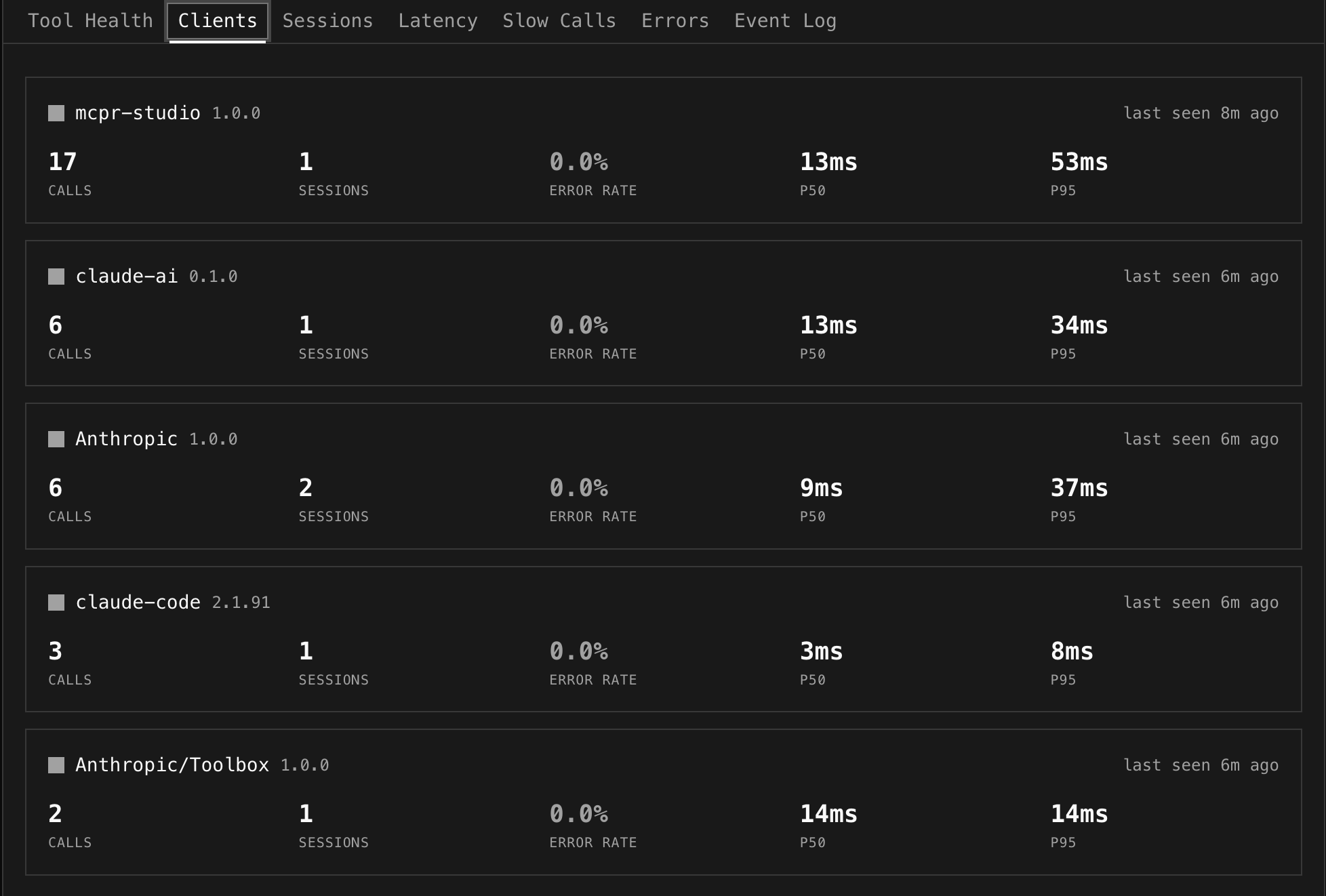
Clients
Section titled “Clients”One card per AI client showing calls, sessions, error rate, p50/p95 latency, and last seen time.
Useful for answering: “VS Code has 4.8% error rate but ChatGPT only 0.9%” — is the problem client-specific? “Claude uses create_payment heavily, ChatGPT doesn’t” — different LLM tool-calling patterns.
Global Filters
Section titled “Global Filters”A filter bar sits above all sub-tabs and applies everywhere:
| Filter | How it works |
|---|---|
| Search | Text search across tool names, session IDs, error messages |
| Tools | Multi-select dropdown — pick specific tools to focus on |
| Client | Filter all data to a single AI client’s traffic |
| Status | Filter by OK, Error, or Denied |
| Time range | Presets (1h, 6h, 24h, 7d, 30d) or custom date range picker |
Screenshot placeholder: Global filter bar — search + tools multi-select + client dropdown + time range
Cross-tab interactions
Section titled “Cross-tab interactions”- Click a client in the breakdown strip → sets client filter, stays on Tool Health
- Click a tool in Tool Health → selects that tool, switches to Event Log
- Click a session ID in Event Log → switches to Sessions with that session expanded
The dashboard works automatically once your proxy syncs events. Add this to your mcpr.toml:
[cloud]token = "mcpr_xxxxxxxx"server = "my-server"Events appear within seconds. No schema setup, no database config — the proxy emits structured events, mcpr.app stores and computes.